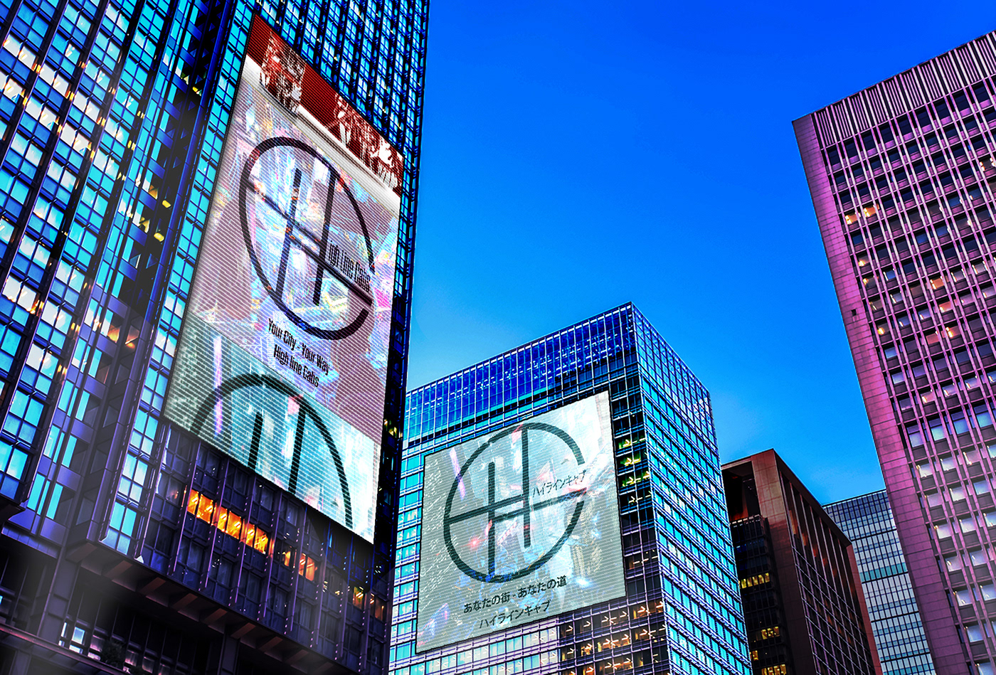
Highline Cabs - Cyberpunk branding concept
This was a collaborative project created by myself and a friend. We tasked ourselves with a design challenge of creating branding for a cyberpunk taxi cab company.
I wanted to emulate the feeling of life in a futuristic NYC, full of colour, activity and people.
Taking inspiration from a New York staple I created High line Cabs, after the famous green space that only NYC could produce.
High line Cabs is a local, New Yorker owned company that prides itself on servicing the city 24/7
With cyberpunk exploring the combining and adoption of 2 or more cultures (usually Western and Japanese aesthetics, iconography etc) I wanted to reflect this in the branding. Creating a logo that reflected the companies name sake as well as a simplified Japanese feel, a long with catering adverts and branding to citizens born of these two cultures.
The advert mock ups reflect the company ethos of being a local firm. " Your city - Your Way" Taking a High line is to be part of the flow of what makes New York, New York.

Emblem logo.

Logo with English word mark.

Logo with Japanese word mark.

Advert to be used in digital and print branding.

Secondary advert to be used in digital and print branding. Both using the brands colours as accents.
Digital ad mock up.

Mock up of a High line cab.

Front mock up.

In situe mock up.


